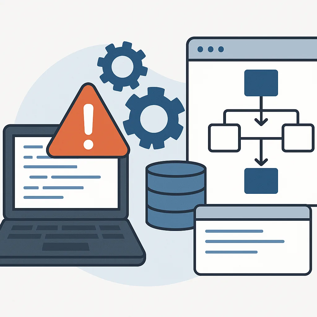

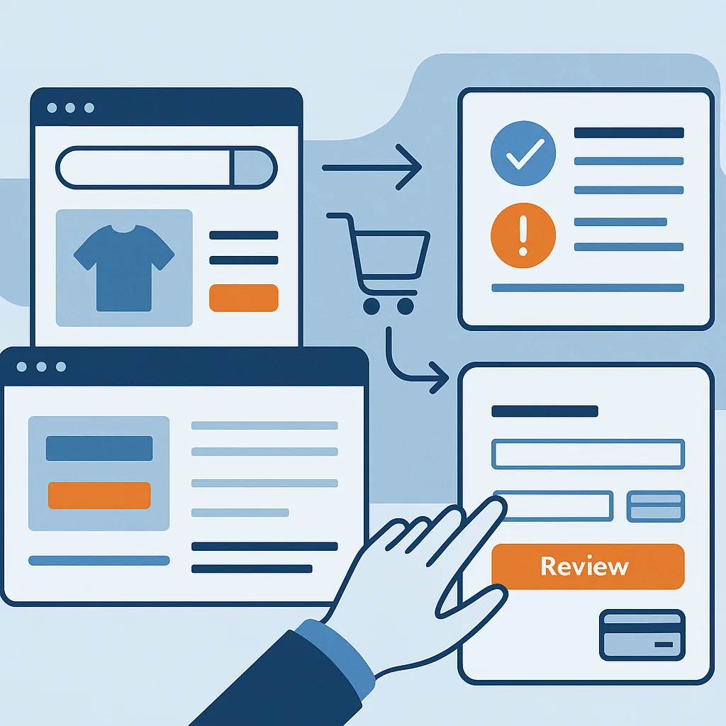
Fast ecommerce sites still lose revenue when shoppers get stuck, confused, or unconvinced. The QA problem is straightforward to describe but easy to miss in practice: teams validate technical performance (load time, availability, scalability) yet ship changes that introduce journey friction (navigation uncertainty, missing information, weak trust signals, checkout obstacles). A quality strategy that treats “fast” as “done” will overlook defects that only appear when you follow a real purchase path end to end.
This article outlines a practical QA approach for ecommerce teams who already monitor performance but need to reduce abandonment by testing the buying journey as a product—using concrete decisions, a test model, and next steps.
Define the QA target: “purchase-path quality,” not page speed
Performance engineering remains essential, but it’s only one slice of what users experience. For ecommerce QA, define a second, equally explicit target:
- Purchase-path quality: a shopper can discover a product, evaluate it, trust the store, and complete payment without unnecessary work, surprises, or confusion—on the devices and browsers you support.
This target helps QA teams avoid a common gap: test cases that verify pages render quickly and APIs respond, but do not verify that a shopper can decide and complete.
Practical decision: add journey acceptance criteria to “Definition of Done”
For any change that can affect shopping flow (navigation, search, product details, promotions, pricing display, checkout), require acceptance criteria in journey terms, for example:
- A first-time visitor can locate a product category, filter, and reach a product page in a reasonable number of steps.
- The product page communicates price, availability, delivery/returns basics, and key attributes without hunting.
- Checkout completion is possible without account creation (if your business rules allow), and errors are recoverable.
- Mobile interaction is usable (tap targets, keyboard types, field focus order).
These aren’t “nice to have” UX notes; they are testable quality requirements.
Map the end-to-end flow and identify “friction hotspots”
Most friction concentrates in a few places:
- Discovery: menus, category pages, search, filters, sorting.
- Evaluation: product pages, images, descriptions, variants, stock, pricing transparency.
- Trust: policies, contact paths, payment security cues, consistency, error handling.
- Commitment: cart, promotions, shipping costs, checkout forms, payment options.
Practical decision: maintain a QA “critical journeys” list
Keep a short list (5–12) of the most important flows, such as:
- Browse → category → filter → product → add to cart
- Search → product → variant selection → add to cart
- Cart → shipping estimate → checkout → payment
- Guest checkout on mobile
- Address change, coupon application, and removal
- Out-of-stock behavior and back navigation
Each journey should specify:
- Entry point (landing page, category, deep link)
- Device class (mobile/desktop)
- Country/currency (if applicable)
- Payment type(s)
- Expected decision info (what must be visible, and when)
Test beyond “works” with decision-support checks on product pages
Product pages are where shoppers decide, so QA should validate not only functional behavior (buttons work) but also decision completeness (the page answers the natural questions).
Create a checklist that QA can apply consistently:
- Clarity of offer: price display, discounts, taxes/VAT labeling (as relevant), shipping costs surfaced at the right time.
- Availability: in-stock status, backorder messaging, delivery estimates (if provided).
- Variant integrity: changing size/color updates SKU-specific details (price, images, stock) correctly.
- Media behavior: images load, zoom works on mobile, video doesn’t block CTAs.
- Content discoverability: key details are visible without excessive scrolling; expandable sections function.
- Error states: invalid variant combinations, quantity limits, and informative messages.
Hypothetical example
A product page loads in under a second, but selecting a variant updates the price while leaving the main image unchanged. Shoppers may interpret that as misleading. QA should treat this as a conversion-impacting defect even if no “error” appears.
Treat trust as a test surface: consistency and transparency
Trust issues often present as “soft” problems, but QA can operationalize them by testing for:
- Consistency: same pricing logic across category, product, cart, and checkout; consistent currency formatting; no contradictory delivery promises.
- Policy findability: returns, shipping, and contact information reachable from key points (product page and checkout).
- Security and payment confidence: payment methods appear when expected; no alarming browser warnings; secure redirects behave correctly.
- Broken and confusing elements: dead links, outdated badges, missing icons, truncated addresses.
Practical decision: add “credibility regressions” to bug severity guidance
Not every UI defect is cosmetic. If an inconsistency could plausibly trigger hesitation (e.g., price changes late, shipping costs appear unexpectedly, policy links fail), classify it as higher severity than typical UI polish.
Make checkout QA intentionally “obstacle hunting”
Checkout is where intent is highest—and where small obstacles cause drop-off. QA should look for friction, not just correctness.
Key checkout test areas:
- Form minimization and behavior: field count, optional vs required clarity, autofill compatibility, input masks that don’t block real data.
- Mobile ergonomics: correct keyboard types (email, numeric), tap targets, focus progression, sticky buttons not covering fields.
- Account pressure: if login is offered, verify guest flow remains viable (if desired), and that sign-in errors don’t trap users.
- Cost transparency: taxes, shipping, fees shown at the right time; no last-step surprises.
- Payment robustness: failure messages that guide recovery; retry paths; state preserved when returning from payment provider.
- Error recoverability: if a field fails validation, user should not lose entered information.
Hypothetical example
A coupon field accepts input but requires tapping a small icon with no label to apply it on mobile. Functionally “working,” it still creates hidden friction. QA should file a usability defect with reproduction steps and device context.
Combine performance monitoring with journey diagnostics
Technical metrics (response time, uptime, server errors) are necessary but don’t explain where users give up. QA can bridge this by ensuring you can diagnose journey breaks:
- Client-side error visibility: JavaScript errors, failed network calls, and timeouts captured in a way teams can triage.
- Funnel-aligned logging: events for add-to-cart, checkout start, payment selection, purchase attempt, purchase success/fail (instrumentation is a product decision; QA validates it fires correctly).
- Release comparison: ability to compare behavior before/after a deployment (even simple timestamped dashboards help).
Practical decision: add instrumentation verification to QA scope
When product analytics or logging changes, QA should test not only UI behavior but also whether key events fire in the correct order with correct payloads—especially on mobile and in Safari-like environments.
A lean, repeatable QA plan you can start next sprint
-
Create a “journey risk register”
- List top flows and the pages/components involved.
- Note the most likely friction points: search, filters, variant selection, shipping costs, login prompts, payment redirects.
-
Build a two-layer test suite
- Layer 1: technical correctness (functional tests, API checks, performance budgets).
- Layer 2: journey friction checks (manual scripted journeys + targeted exploratory sessions).
-
Introduce pre-release “purchase-path reviews”
- 30–60 minutes per release focused on critical journeys.
- Run on at least one representative mobile device and one desktop browser.
-
Codify bug reporting for conversion-impact defects
- Require: journey step, device/browser, screenshots/video, and “why this blocks decision or completion.”
- Tag issues as discovery/evaluation/trust/checkout to spot patterns.
-
Close the loop with post-release sampling
- After deployment, re-run critical journeys.
- Verify logging/analytics events still fire (if your product relies on them for monitoring).
What “good” looks like
A fast site becomes a growth platform when QA can confidently say:
- The store stays responsive under expected load and
- Shoppers can find products, understand offers, trust the store, and complete checkout with minimal friction—especially on mobile.
Treat performance as the foundation, but make the purchase journey the primary quality objective. That shift changes what you test, how you classify defects, and what you prioritize next.
Background reading: Software Testing Magazine. This article presents Anbosoft’s own analysis and recommendations.